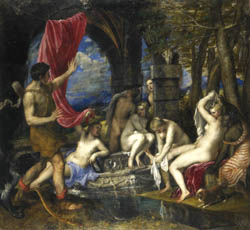
I had the opportunity to go see the Titian and the Golden Age of Venetian Painting Exhibition at the High Museum. The highlight and focus of the exhibition is the the two Diana paintings. I loved how the exhibit is set up in relation to the Diana paintings. People are encouraged to enter the exhibit, and start on the second floor of the building, where the lower level of the exhibit is located. This floor contained preparatory drawings and sketches from several venetian painters. So when you started going through the exhibit, you started seeing the drawings that precede the paintings, and the exhibit mentioned the Diana paintings in several places. And then when you go to the third floor, where the upper level of the exhibit is, you finally see the Diana paintings after hearing about them, building up anticipation. The Diana paintings are hanging in the middle of the room, and the walls are curved towards the two paintings. I really like how the exhibition built anticipation waiting to see the two famous paintings, and then they were revealed as the focal point of the upper floor of the exhibition. Furthermore, I also like that the walls of the exhibit are a dark red. It makes the exhibit feel more intimate and close together, and it provides more contrast to the drawings and paintings than the plain white walls that are in the rest of the museum would have. The white walls would have made the exhibition feel too spaced out, and would not have made the paintings feel as vibrant as the dark red.
The two Diana Paintings, painted by Titian:
Diana and Actaeon:
Diana and Callisto:
Pictures Source: http://www.high.org/main.taf?p=3,1,1,22,7


No comments:
Post a Comment